Happy Thursday.
Quick test: picture a fintech app in bright orange.
Felt weird, right? That discomfort is color psychology doing its job. Onto it.
Reading time: 4 minutes, 48 seconds
Boost your bottom line by correctly calculating the affiliate commission you can offer creators and influencers

Your best creator just posted for a competitor. It wasn’t the product. The brand wasn’t even bigger.
But their commission offer was.
Too often, e-commerce brands set commission rates using first-order margin. The numbers look great internally…until placements dry up and partners go ghost.
Single-order economics ignores what makes affiliate and creator partnerships actually valuable. It’s the new-to-brand customer who comes back 60 days later to purchase again, and who likely would have never discovered your brand through PPC.
When the math factors in LTV, repeat purchase rate, and new-to-brand mix, brands discover they can profitably offer more than their current rate card suggests.
Levanta’s Free Commission Calculator shows exactly where that ceiling exists.
And it only takes two minutes.
Colors Psychology

You’ve never “just picked” a color.
Every shade triggers an emotional chain reaction before your conscious brain even registers it.
That’s color psychology—how hues shape perception, emotion, and buying decisions without asking permission.
Satyendra Singh found in 2026 that up to 90% of snap product judgments can be based on color alone. Fast, automatic, and unconscious.
Researchers call this chromatic priming—repeated color-context pairings that train automatic emotional associations over time.
But colors don’t carry universal meaning. Context rewrites everything.
Red on a stop sign means danger. Red on a sale banner means opportunity. Same wavelength, completely different emotional response.
What stays consistent: color pre-loads expectations in the viewer’s mind before any content lands. Let’s check some more examples…
A SaaS landing page in blue feels trustworthy. An ecommerce flash-sale banner in red feels urgent. That’s all measurable.
Color even affects perceived product quality. Warmer tones feel premium. Cooler tones suggest efficiency and precision.
This is why fintech brands overwhelmingly lean blue, while clearance sections at every major retailer are drenched in red.
Joe Hallock’s color research confirmed blue dominates as the most universally preferred color, especially for signaling dependability.
Long story short, treat color as branding only and you’re ignoring one of the most powerful subconscious persuasion levers in the toolkit. Let’s see how to leverage it.
Three ways to leverage Colors Psychology
1) Use blue to anchor trust in high-stakes products
Xero, the cloud accounting SaaS, builds its entire brand identity around blue.
For a product handling sensitive financial data, that’s fully intentional.
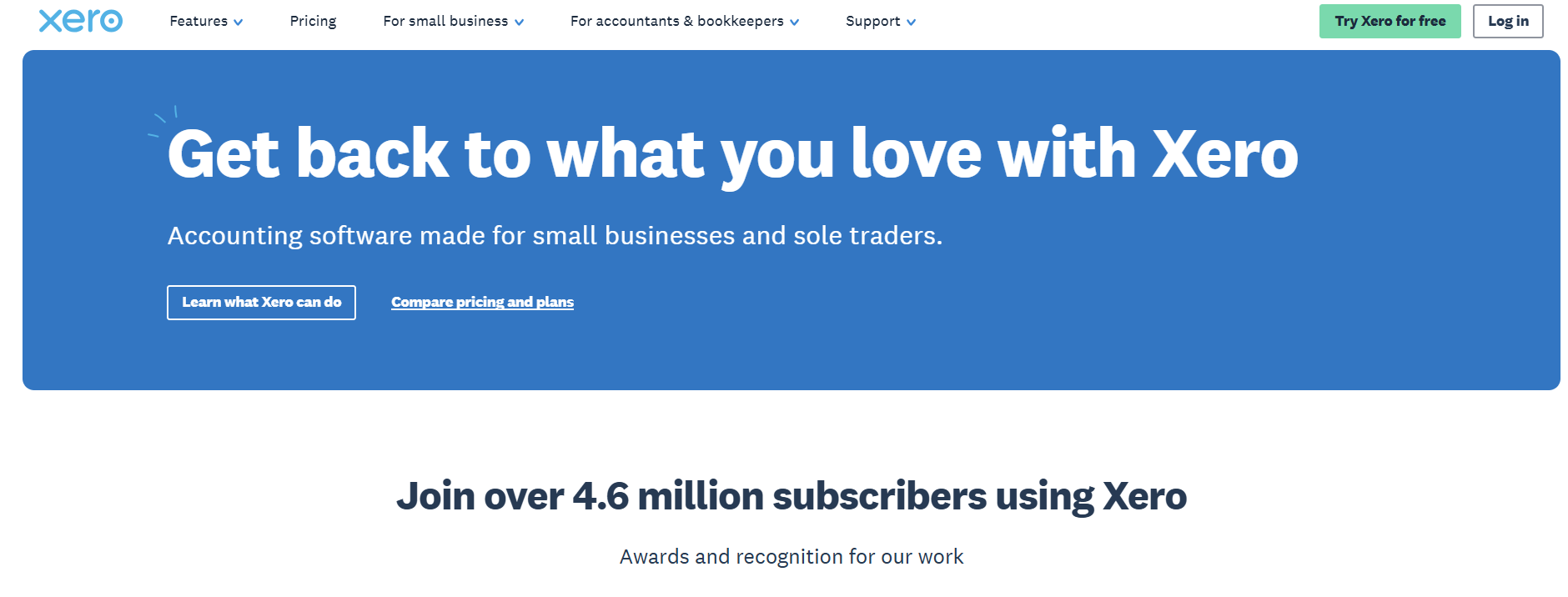
Blue consistently ranks as the most trusted color across cultures and demographics. It signals calm, reliability, and security at a glance.
Xero deploys it on CTAs, dashboards, onboarding screens, and email communications. Every touchpoint reinforces one subconscious message: your money is safe here.
Our take: When your product asks for sensitive info, your color palette needs to earn trust before your copy gets the chance.
2) Use red to manufacture purchase urgency
Want to remove the pause from any decision making process? Use red.
Research by Bagchi and Cheema found red backgrounds during competitive scenarios led to significantly more aggressive purchasing behavior among participants.
SHEIN plasters red countdown timers, percentage-off badges, and flash-deal banners across its entire mobile app. Every scroll triggers urgency cues.

For a fast-fashion brand selling $8 tops, red removes the “let me think about it” entirely. It compresses decision-making time by design.
That’s how you do it, too.
3) Break category color norms to own your position
Canva could have chosen corporate blue like every other productivity SaaS.
Instead they used teal and purple to position themselves as the playful alternative to Adobe’s intimidating palette.
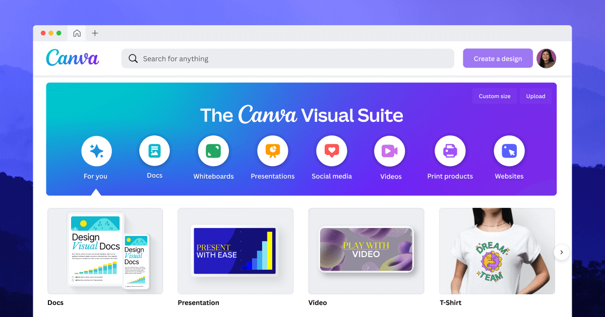
That color contrast alone signals that the app’s target audience are everyone and not only designers.
You don’t need a tagline. The palette does the talking.
T-Mobile pulled the same move in telecom. Magenta carved instant recognition in a sea of blue and red carriers.
Think about it…
Stop drowning in AI information overload
Your inbox is flooded with newsletters. Your feed is chaos. Somewhere in that noise are the insights that could transform your work—but who has time to find them?
Replace hours of scattered reading with five focused minutes. While others scramble to keep up, you’ll stay ahead of developments that matter. 500,000+ professionals at top companies have already made this switch.
LINKEDIN: A study of 1.3M posts found PDF carousels outperformed every other format for engagement on LinkedIn. But there’s a caveat—document posts are less common in the dataset, which could inflate their numbers. Still, the signal is strong enough to act on.
ADVERTISING: Self-serve ChatGPT Ads are opening up in April, expanding beyond the US to Canada, Australia, and New Zealand. Tempting, but early CTRs sit at just 0.91% against Google’s 6.4% benchmark. Worth watching, not necessarily worth rushing.
MARKETING: Pinterest revealed that its recommendation engine deliberately avoids showing too much of the same thing. Why? Show people too much of the same thing and they leave. Lean too hard into one interest and the feed starts to feel stale. Take note.
GOOGLE: Gmail’s AI inbox is playing gatekeeper. It sorts your messages by behaviour, relationships, and past clicks before you even look. This means Promotions can disappear into the void and the algorithm is taking over, so send emails people actually want to open.
ICYMI, last time we looked at the Pluralistic Ignorance.
The “Hue” Crew.
Interested in advertising in one of our newsletters?
Connect with over 100,000 of the world’s best marketers who read a newsletter by Stacked Marketer.